Table of Contents
- Getting Started
- EO.Pdf
- EO.Web
- EO.WebBrowser
- EO.Wpf
- Overview
- Installation & Deployement
- Skin & Theme
- Common Taskes and Services
- EO.Wpf Buttons
- EO.Wpf Calendar & DatePicker
- EO.Wpf Calendar & DatePicker
- Using YearPicker
- Using MonthPicker
- Using EO.Wpf Calendar
- Using EO.Wpf DatePicker
- EO.Wpf ComboBox
- EO.Wpf DockView
- EO.Wpf Gauge
- EO.Wpf ListBox
- EO.Wpf Menu
- EO.Wpf MaskedEdit
- EO.Wpf ProgressBar
- EO.Wpf Slider
- EO.Wpf SpinEdit
- EO.Wpf SplitView
- EO.Wpf TabControl
- EO.Wpf TreeView
- EO.Wpf Utility Controls
- EO.Wpf WindowChrome
- Sample Data Objects
- Common Topics
- Reference
| Using MonthPicker |
Overview
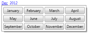
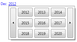
EO.Wpf MonthPicker extends the functionality of the YearPicker control so that you can use a single control to pick both year and month. A MonthPicker displays a link button both for the month and the year, as demonstrated in the following screenshots.
When month drop down is open:

When year drop down is open:

Customzing MonthPicker
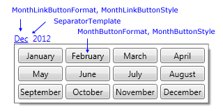
The year portion of the MonthPicker can be customized through YearPickerStyle. See here for more information about customizing the year picker. The following diagram demonstrates other customization properties provided by the MonthPicker:

MonthLinkButtonFormat and MonthButtonFormat can be used to customize the text of the month link button and month button inside the drop down respectively. For example, the default value for MonthLinkButtonFormat is "MMM", which format the month link button to display the abbreviated name of the month, while the default MonthButtonFormat is "MMMM", which format the month button inside the drop down to display the full name of the month.
SeparatorTemplate can be used to customize the separator portion of the month picker. The default separator is a TextBlock with two space characters. You can change this to introduce other type of separators. For example, the following code changes the Separator to " - ":
<eo:MonthPicker>
    <eo:MonthPicker.SeparatorTemplate>
        <DataTemplate>
            <TextBlock Text=" - " />
        </DataTemplate>
    </eo:MonthPicker.SeparatorTemplate>
</eo:MonthPicker>
The above code produces the following result:

Getting MonthPicker Value
The MonthPicker provides SelectedDate and SelectedYear for you to get/set the selected year and month as a DateTime value or just the year value as an integer alone.

