Table of Contents
- Getting Started
- EO.Pdf
- EO.Web
- EO.WebBrowser
- EO.Wpf
- Overview
- Installation & Deployement
- Skin & Theme
- Common Taskes and Services
- EO.Wpf Buttons
- EO.Wpf Calendar & DatePicker
- EO.Wpf ComboBox
- EO.Wpf DockView
- EO.Wpf Gauge
- EO.Wpf ListBox
- EO.Wpf Menu
- EO.Wpf MaskedEdit
- EO.Wpf ProgressBar
- EO.Wpf Slider
- EO.Wpf SpinEdit
- EO.Wpf SplitView
- EO.Wpf TabControl
- EO.Wpf TreeView
- EO.Wpf Utility Controls
- EO.Wpf WindowChrome
- Sample Data Objects
- Common Topics
- Reference
| Overview |
EO.Wpf RadialPanel arranges child controls in a circular manner that can be particular useful for various UI elements such as gauge or clock panels. This section explains how to use the RadialPanel control.
Using RadialPanel consists of three major steps:
- Define the center point, start angle and end angle;
- Defining the rings;
- Arranging child controls on the ring;
The first step of using a RadialPanel is to define the center point, start angle and end angle of the rings. While you can have multiple rings in a single RadialPanel, all the rings must share the same center point (specified through RadialPanel.OriginX and RadialPanel.OriginY), start angle (specified through RadialPanel.StartAngle) and end angle(specified through RadialPanel.EndAngle, both are in degrees and grows clockwise). The following code defines the center position as the center point of the bottom border of the RadialPanel, set start angle to 180, and end angle to 360. In essence, the top half of a circle.
<eo:RadialPanel Width="200" Height="200" OriginX="50%" OriginY="100%" StartAngle="180" EndAngle="360">
   .....
</eo:RadialPanel>
Note in order to define a top half circle, StartAngle is 180 and EndAngle is 360. This is because the angle always grows clockwise.
Both OriginX and OriginY takes absolute value as well as percentage values. The above code uses percentage values. When percentage values are used, OriginX is based on the full width of the RadialPanel control, while OriginY is based on the full height of the RadialPanel control.
The next step is to use the RadialPanel's RingDefinitions property to define one or more rings. The following code demonstrates a RadialPanel with two rings:
<eo:RadialPanel Width="200" Height="100"
    OriginX="50%" OriginY="100%" StartAngle="180" EndAngle="360">
    <eo:RadialPanel.RingDefinitions>
        <eo:RingDefinition RadiusX="50" RadiusY="50" Width="10" Height="10"></eo:RingDefinition>
        <eo:RingDefinition RadiusX="75" RadiusY="75" Width="20" Height="20"></eo:RingDefinition>
    </eo:RadialPanel.RingDefinitions>
</eo:RadialPanel>
A ring is defined by the following elements:
- The center point of the ring as defined by the RadialPanel's OriginX and OriginY property;
- The radius of the ring. Two different values can be used for x-axis radius and y-axis radius respectively. In the above sample, both values are the same for the first ring as 50, and for the second ring as 75;
- The "thickness" of the ring as defined by RingDefinition.Width and RingDefinition.Height property. Like radius, these two values are for x-axis and y-axis respectively;
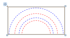
You can set the RadialPanel's ShowRings property to true so that the RadialPanel displays a red dotted line for the inner edge of the ring and a blue dotted line for outer edge of the ring. Note this property is intended as a design tool to debug layout problems only.
The following image is a design time screenshot of the above code with ShowRings set to true that illustrates the position of the rings.

Once the rings are defined, you can start to arrange child items on the ring. By default, all children elements are evenly distributed on ring 0. The following code added 5 children TextBlock elements into the RadialPanel:
<Window x:Class="Test.MainWindow"
        xmlns="http://schemas.microsoft.com/winfx/2006/xaml/presentation"
        xmlns:x="http://schemas.microsoft.com/winfx/2006/xaml"
        xmlns:eo="http://schemas.essentialobjects.com/wpf/"
        Title="MainWindow" Height="250" Width="350">
    <eo:RadialPanel Width="200" Height="100"
        OriginX="50%" OriginY="100%" StartAngle="180" EndAngle="360"
        ShowRings="True" ClipToBounds="False">
        <eo:RadialPanel.RingDefinitions>
            <eo:RingDefinition RadiusX="50" RadiusY="50" Width="10" Height="10"></eo:RingDefinition>
            <eo:RingDefinition RadiusX="75" RadiusY="75" Width="20" Height="20"></eo:RingDefinition>
        </eo:RadialPanel.RingDefinitions>
        <TextBlock>1</TextBlock>
        <TextBlock>2</TextBlock>
        <TextBlock>3</TextBlock>
        <TextBlock>4</TextBlock>
        <TextBlock>5</TextBlock>
    </eo:RadialPanel>
</Window>
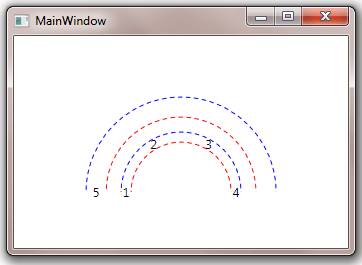
The above code produces the following result:

As shown in the image, the children TextBlock elements are evenly arranged on the first ring. Note the code also set the RadialPanel's ClipToBounds to false so that TextBlock "1" and "5" would not be clip off.
You can use RadialPanel.Ring attached property to set the target ring of an element. The following code moves the TextBlock "5" from the first ring to the second ring:
<Window x:Class="Test.MainWindow"
        xmlns="http://schemas.microsoft.com/winfx/2006/xaml/presentation"
        xmlns:x="http://schemas.microsoft.com/winfx/2006/xaml"
        xmlns:eo="http://schemas.essentialobjects.com/wpf/"
        Title="MainWindow" Height="250" Width="350">
    <eo:RadialPanel Width="200" Height="100"
        OriginX="50%" OriginY="100%" StartAngle="180" EndAngle="360"
        ShowRings="True" ClipToBounds="False">
        <eo:RadialPanel.RingDefinitions>
            <eo:RingDefinition RadiusX="50" RadiusY="50" Width="10" Height="10"></eo:RingDefinition>
            <eo:RingDefinition RadiusX="75" RadiusY="75" Width="20" Height="20"></eo:RingDefinition>
        </eo:RadialPanel.RingDefinitions>
        <TextBlock>1</TextBlock>
        <TextBlock>2</TextBlock>
        <TextBlock>3</TextBlock>
        <TextBlock>4</TextBlock>
        <TextBlock eo:RadialPanel.Ring="1">5</TextBlock>
    </eo:RadialPanel>
</Window>
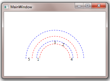
The above code produces the following result:

Note that TextBlock "5" is moved to the second ring and elements in the first rings are rearranged.
By default, all child elements on a single ring are evenly distributed. You can use RadialPanel.Angle attached property to explicitly specify the angle of an element. For example, the following code "fixes" TextBlock "2" at 60 degrees:
<Window x:Class="Test.MainWindow"
        xmlns="http://schemas.microsoft.com/winfx/2006/xaml/presentation"
        xmlns:x="http://schemas.microsoft.com/winfx/2006/xaml"
        xmlns:eo="http://schemas.essentialobjects.com/wpf/"
        Title="MainWindow" Height="250" Width="350">
    <eo:RadialPanel Width="200" Height="100"
        OriginX="50%" OriginY="100%" StartAngle="180" EndAngle="360"
        ShowRings="True" ClipToBounds="False">
        <eo:RadialPanel.RingDefinitions>
            <eo:RingDefinition RadiusX="50" RadiusY="50" Width="10" Height="10"></eo:RingDefinition>
            <eo:RingDefinition RadiusX="75" RadiusY="75" Width="20" Height="20"></eo:RingDefinition>
        </eo:RadialPanel.RingDefinitions>
        <TextBlock>1</TextBlock>
        <TextBlock eo:RadialPanel.Angle="60">2</TextBlock>
        <TextBlock>3</TextBlock>
        <TextBlock>4</TextBlock>
        <TextBlock eo:RadialPanel.Ring="1">5</TextBlock>
    </eo:RadialPanel>
</Window>
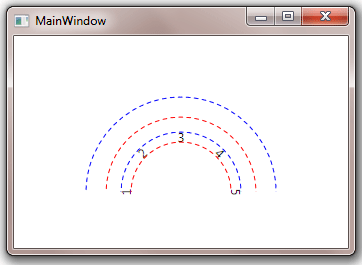
The above code produces the following result:

Attached property RadialPanel.RotationMode can be used to specify the rotation mode of a ring or a single element. The following sample has the first ring's Rotation set to Radial:
<Window x:Class="Test.MainWindow"
        xmlns="http://schemas.microsoft.com/winfx/2006/xaml/presentation"
        xmlns:x="http://schemas.microsoft.com/winfx/2006/xaml"
        xmlns:eo="http://schemas.essentialobjects.com/wpf/"
        Title="MainWindow" Height="250" Width="350">
    <eo:RadialPanel Width="200" Height="100"
        OriginX="50%" OriginY="100%" StartAngle="180" EndAngle="360"
        ShowRings="True" ClipToBounds="False">
        <eo:RadialPanel.RingDefinitions>
            <eo:RingDefinition RadiusX="50" RadiusY="50" Width="10" Height="10" eo:RadialPanel.RotationMode="Circular"></eo:RingDefinition>
            <eo:RingDefinition RadiusX="75" RadiusY="75" Width="20" Height="20"></eo:RingDefinition>
        </eo:RadialPanel.RingDefinitions>
        <TextBlock>1</TextBlock>
        <TextBlock>2</TextBlock>
        <TextBlock>3</TextBlock>
        <TextBlock>4</TextBlock>
        <TextBlock>5</TextBlock>
    </eo:RadialPanel>
</Window>
The above code produces the following result:


