Table of Contents
- Getting Started
- EO.Pdf
- EO.Web
- EO.WebBrowser
- EO.Wpf
- Overview
- Installation & Deployement
- Skin & Theme
- Common Taskes and Services
- EO.Wpf Buttons
- EO.Wpf Calendar & DatePicker
- EO.Wpf ComboBox
- EO.Wpf DockView
- EO.Wpf Gauge
- EO.Wpf ListBox
- EO.Wpf Menu
- EO.Wpf MaskedEdit
- EO.Wpf ProgressBar
- EO.Wpf Slider
- EO.Wpf SpinEdit
- EO.Wpf SplitView
- EO.Wpf TabControl
- EO.Wpf TreeView
- EO.Wpf Utility Controls
- EO.Wpf WindowChrome
- Sample Data Objects
- Common Topics
- Reference
| EO.Wpf SplitButton |
EO.Wpf SplitButton has the same programming interface and functions almost identical to an DropDownButton, except that the button is divided into two halves: the left half functions like a regular push button and the right half functions like a drop down button. The following sample demonstrates how to use a SplitButton:
<Window x:Class="Test.Window1"
        xmlns="http://schemas.microsoft.com/winfx/2006/xaml/presentation"
        xmlns:x="http://schemas.microsoft.com/winfx/2006/xaml"
        xmlns:eo="http://schemas.essentialobjects.com/wpf/"
        Title="Window1"
        Height="300"
        Width="400">
    <StackPanel>
        <eo:SplitButton Width="220" HorizontalAlignment="Left" Click="SplitButton_Click">
            <eo:SplitButton.DropDown>
                <eo:DropDown>
                    <StackPanel Margin="3" Width="100">
                        <TextBlock TextWrapping="Wrap">
                            This is a sample drop down used by a SplitButton.
                        </TextBlock>
                    </StackPanel>
                </eo:DropDown>
            </eo:SplitButton.DropDown>
            Click Me To Open The Drop Down
        </eo:SplitButton>
    </StackPanel>
</Window>
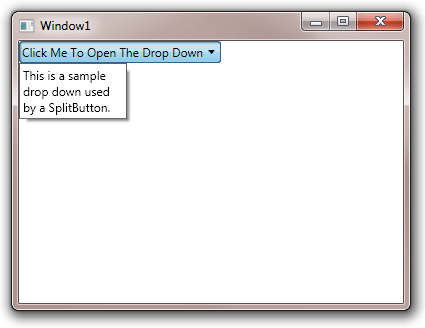
The above code is almost identical to the sample code found here for EO.Wpf DropDownButton, the only difference being the class name in this sample is SplitButton instead of DropDownButton. This sample produces the following result:

Note the little drop down arrow on the right side of the button. Clicking this drop down arrow triggers the drop down, clicking other area of the button functions as a regular button and triggers a button click event.

